
October 2026
Abstract Art for Minimalist Home Decor: 2026 Guide

Table of Contents
- Why Abstract Art Belongs in a Minimalist Home
- Quick Comparison: Museum Prints vs. Gallery Prints
- Large Minimalist Abstract Wall Art: Making a Statement Without Clutter
- Neutral Abstract Art Prints for Calm, Timeless Rooms
- How to Style Abstract Art in Living Rooms, Offices, and Hallways
- Art Placement and Scale: Getting the Size Right
- Material Quality and Longevity: What Museum-Quality Actually Means
- Frequently Asked Questions
Last Updated: October 2, 2026
Why Abstract Art Belongs in a Minimalist Home
Abstract art for minimalist home decor gives a quiet room a focal point without adding visual noise: a single geometric print can anchor a wall, while a cluster of busy objects only creates clutter. This guide from Mark Travers Artist LLC covers how to choose, size, and place abstract work so your space feels deliberate rather than empty.
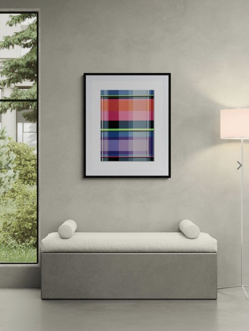
Minimalism is not about owning less for its own sake. It is about removing what competes for attention so the few things you keep can speak clearly. A large abstract canvas does exactly that.
Quick Comparison: Museum Prints vs. Gallery Prints
Museum prints use archival pigment inks on heavyweight cotton paper and are signed with a certificate of authenticity. Gallery prints use premium card stock at a lower price. Both belong in a minimalist home; the choice comes down to budget, scale, and whether you want a collectible piece.
| Feature | Museum Print | Gallery Print |
|---|---|---|
| Paper | Epson Hot Press Bright White 330gsm | 100 lb. premium card stock |
| Signed | Yes | No |
| Certificate of Authenticity | Included | Not included |
| Typical sizes | 16" to 36" | 8" to 12" |
| Starting price | $180 | $19 |
| Best for | Focal walls, collectors | Groupings, small spaces |
Large Minimalist Abstract Wall Art: Making a Statement Without Clutter
Large minimalist abstract wall art solves the scale problem small prints create: one oversized piece reads as intentional, while five small frames read as busy. If your wall feels bare, the fix is one bigger work, not more works.
Neutral Abstract Art Prints for Calm, Timeless Rooms
Neutral abstract art prints keep a room calm by limiting the palette to a few understated tones, a restrained range feels timeless rather than tied to a trend, and it is the safest route if you worry about tiring of a bold work.
How to Style Abstract Art in Living Rooms, Offices, and Hallways
Styling abstract art comes down to three rules: match the scale to the wall, keep the surrounding palette quiet, and let one piece lead. Here is how that plays out in the three spaces where minimalist art does the most work.
Living rooms: anchor the seating, not the wall
The living room is where scale mistakes are most visible. Designers treat the sofa as the anchor and size the art to it, not the wall: center the piece on the sofa and let the wall breathe on either side. In an open-plan room, centering on the wall instead of the furniture is the most common reason a large canvas looks off-axis.
Home offices: keep the sightline clear
In a contemporary home office, the art sits in your peripheral vision for hours, so choose a piece that registers when you look up but does not pull your eye while you work. Pick a smaller work, typically 20" to 30" wide, hung so the center lands at roughly 57 to 60 inches from the floor, the same eye-level rule used in living rooms.
Hallways: the most underused wall in the house
Hallways reward repetition because the viewer is moving. A run of four small Meditations prints at $19 each turns a corridor into a gallery walk: keep spacing even at 2 to 3 inches and align the centers on one horizontal line. Buy all four and the checkout applies a $19 savings.
Art Placement and Scale: Getting the Size Right
Getting the size right matters more than any other styling decision: art too small for its wall looks lost, art too large crowds the room. A useful rule is that art should span about two-thirds to three-quarters of the width of the furniture below it.
Use this quick guide before you buy:
| Wall / Furniture | Recommended Art Width | Example |
|---|---|---|
| Above a 72" sofa | 48" to 54" total | One 24" x 24" centered, or two side by side |
| Above a desk | 20" to 30" | 20" x 20" single print |
| Narrow hallway wall | 8" to 12" per piece | Grouping of four 8" x 8" prints |
| Tall empty wall | 30" or larger | 30" x 30" or 29" x 36" statement piece |
Material Quality and Longevity: What Museum-Quality Actually Means
Museum-quality means the print uses archival pigment inks on acid-free, heavyweight paper so colors hold for decades rather than fading in a few years. What most buying guides skip is the mechanism of fading, the trade-offs between substrates, and how to tell whether a seller actually uses archival materials or just the word.
Why prints fade: the mechanism
Fading is a chemical reaction: light, oxygen, and humidity break down the colorants in ink and the fibers in paper. Pigment inks resist this far better than dye-based inks because the colorant is suspended as solid particles rather than dissolved, and acid in paper accelerates yellowing, which is why archival paper is buffered to a neutral or slightly alkaline pH.
Substrate trade-offs: paper, canvas, metal, wood
Each substrate solves a different problem.
- Cotton rag paper (300gsm and up): the sharpest detail, the most accurate color, and the easiest to frame behind glass. It is the default for museum prints. It is also the most vulnerable to moisture and handling, always frame it.
- Canvas: more forgiving of humidity and does not need glass, which makes it a good fit for large statement pieces and rooms with variable airflow. The trade-off is slightly softer detail and a visible weave that some minimalist palettes do not want.
- Metal: rigid, modern, and resistant to warping, which suits industrial and contemporary minimalist rooms. Color can look cooler than on paper, and metal prints are harder to reframe if your palette changes.
- Wood: warm and tactile, but wood moves with humidity. It works best for smaller works in climate-controlled rooms.
For a minimalist home, paper and canvas cover most needs. Paper for framed works at desk or hallway scale; canvas for the one large piece that anchors a living room.
How to evaluate a seller before you buy
Ask three questions: What ink type, pigment or dye? What paper weight and fiber, cotton rag, alpha-cellulose, or coated stock? Is the piece signed and does it include a Certificate of Authenticity? A seller using archival materials answers all three without hesitation; one using "museum-quality" as marketing will hedge.
Framing and display choices that extend lifespan
Glass or acrylic with UV filtering blocks the wavelengths that do most of the damage, and matting keeps the art off the glazing so condensation does not touch the surface. Avoid hanging opposite a window with direct afternoon sun, keep pieces off exterior walls in humid climates, and rotate art seasonally.
Frequently Asked Questions
How do you choose abstract art for a minimalist home?
Start with the room's existing palette. A minimalist space usually has two or three dominant colors, so pick minimalist abstract art that echoes one of them and introduces just one accent. Consider scale next: a large minimalist abstract wall art piece can anchor a bare wall better than several small prints. Finally, check the material. Museum-quality prints on archival paper with pigment inks hold their color for decades, so the piece stays worth keeping.
Does abstract art fit in a minimalist interior?
Yes. Minimalism is about removing what does not earn its place, not about empty walls. A single abstract piece gives the eye somewhere to rest and adds warmth without visual noise. Geometric and color-field styles work especially well because their clean shapes and limited palettes match the simplicity of minimalist furniture. The key is choosing one strong piece rather than filling every wall.
What colors work best for minimalist abstract wall art?
Neutral abstract art prints in beige, taupe, off-white, and soft gray blend easily with most minimalist interiors. If you want more presence, add a piece with one saturated color, such as the ultramarine blue and taupe in Sacred Symmetry 1, or the reds and yellows in Mountains & Shadows 5. Keep the total palette to three colors or fewer so the artwork reads as intentional rather than busy.
How large should abstract art be for a minimalist living room?
A common guideline is that artwork should span about two-thirds to three-quarters of the width of the furniture below it. Above a 72-inch sofa, that means a piece roughly 48 to 54 inches wide, or a 30-inch square canvas paired with generous wall space. Larger works like Prism Break, available at 24" x 30" and 29" x 36", suit open-concept rooms where a single focal point replaces several small decorations.
Where should you hang abstract art in a minimalist home?
Hang the main piece at eye level, generally 57 to 60 inches from the floor to the center of the artwork. In living rooms, place it above the sofa or a console. In home offices, position it behind the desk so it sits in your view during calls. Hallways work well for a vertical arrangement or a single square print. Keep surrounding walls clear so the artwork stays the focal point.
